Website by Harrison Oak © 2025
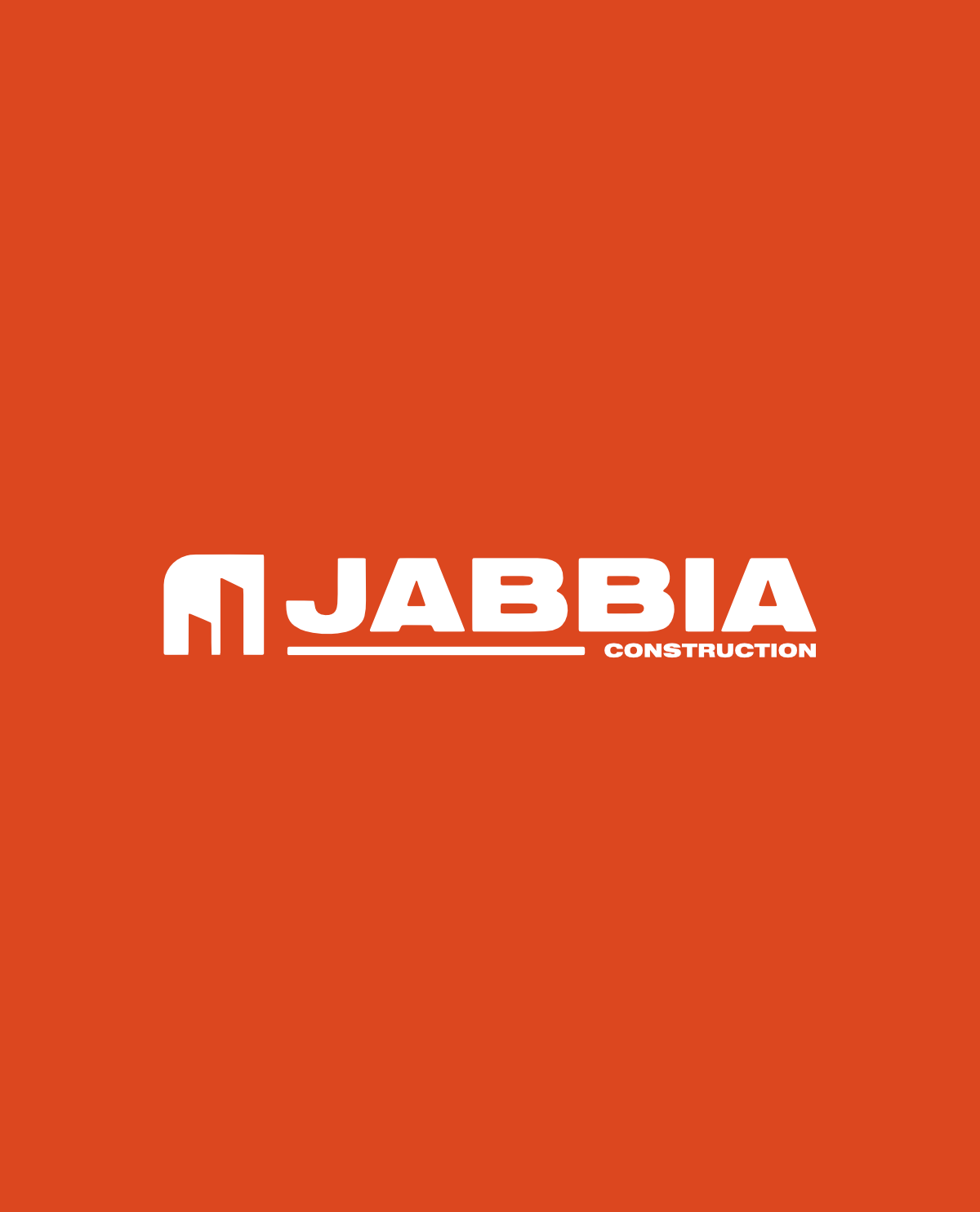
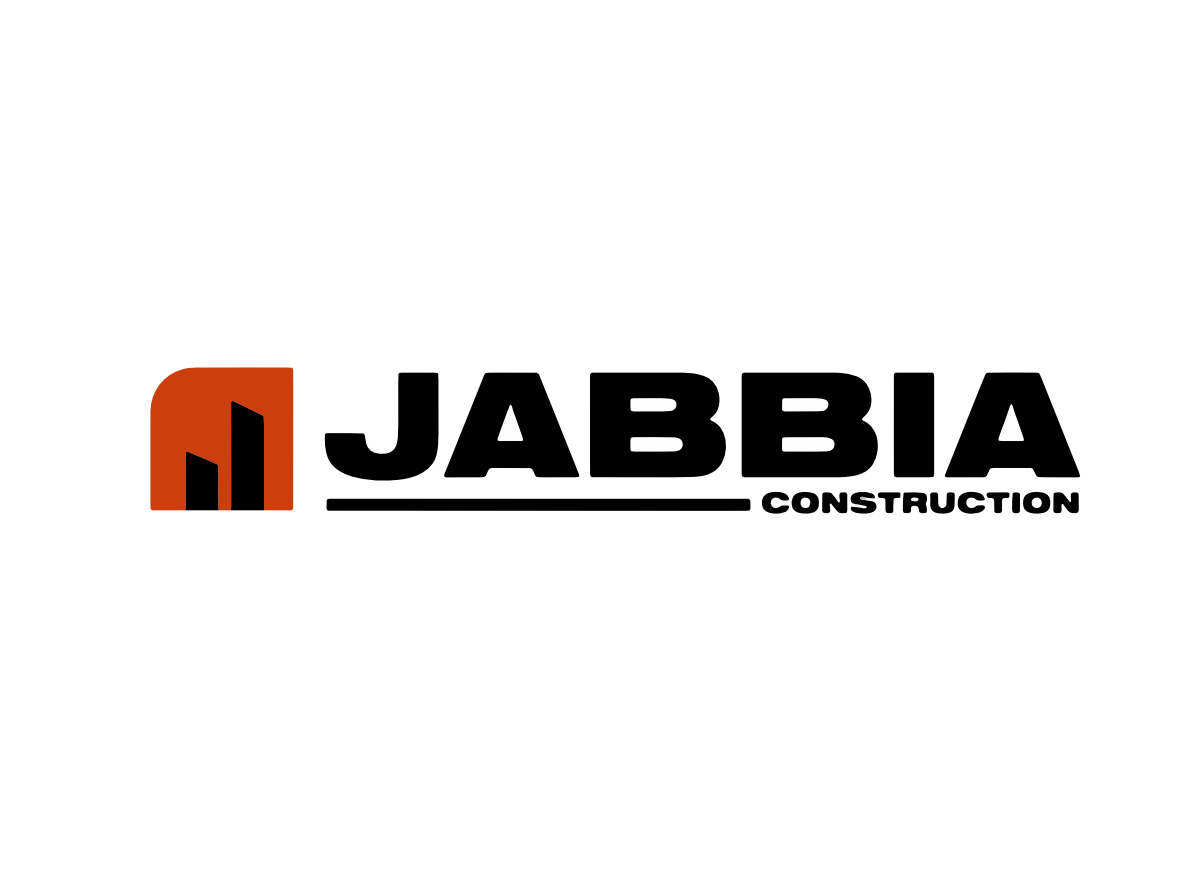
The minimal logo I designed for Jabbia contains a double read of both a capital "J" and two buildings. The brand identity is based on classic construction themes and strong use of color and bold typography.
This brand identity extends into all of the various Jabbia materials - including several printed materials.
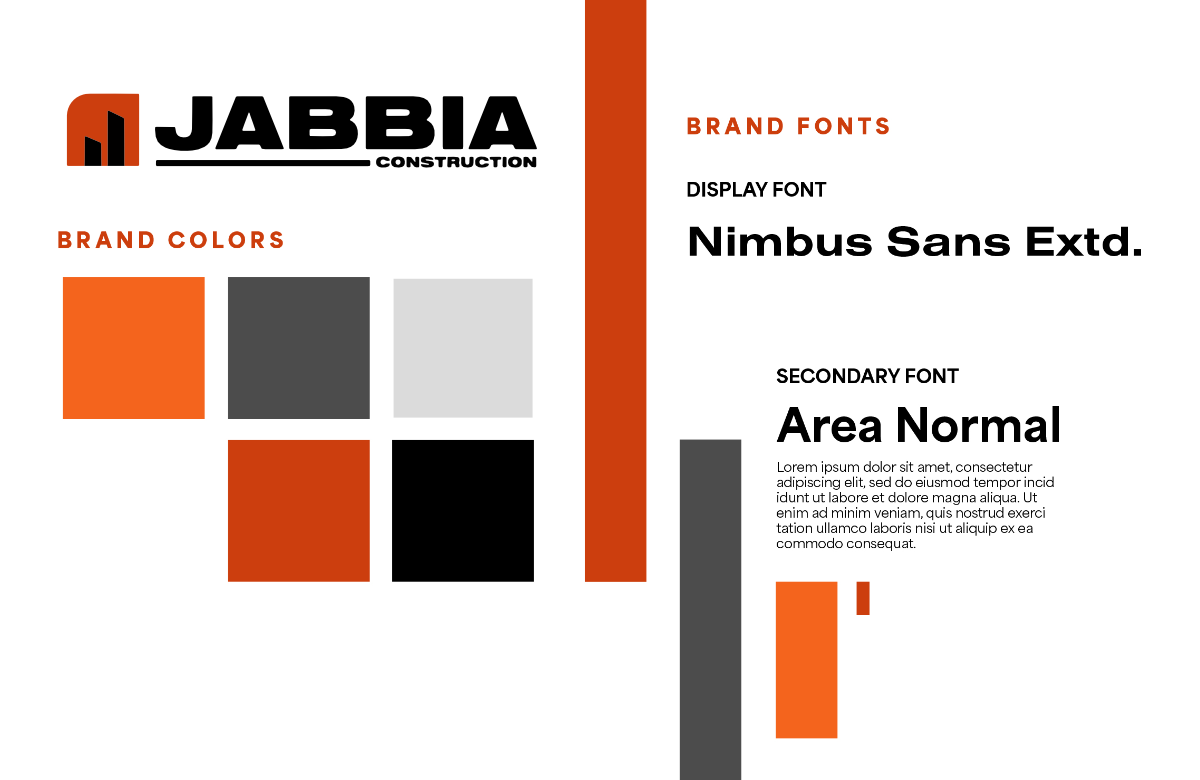
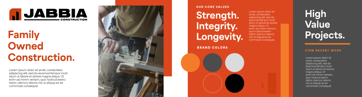
Matching brand materials make this project an all-encompassing identity
Project materials included: