Website by Harrison Oak © 2025
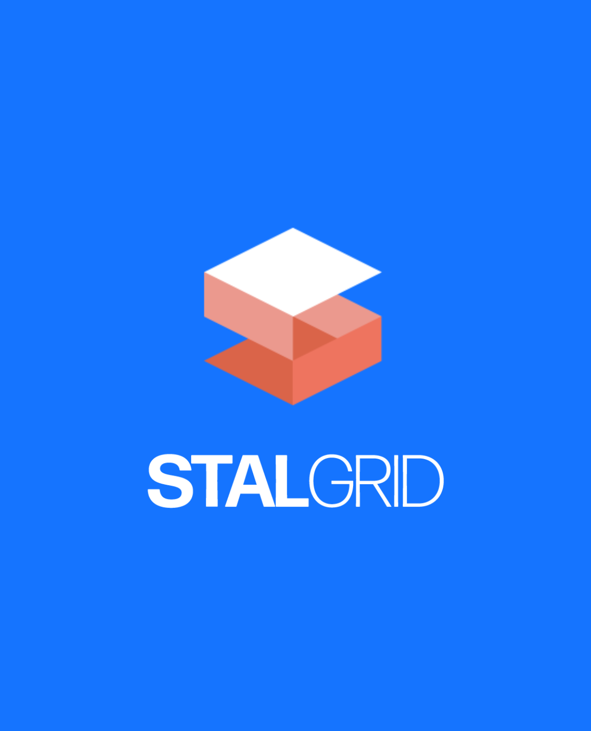
Sticking to classic grid based designs and geometric shapes is the approach I took here. A strong, but very minimal typeface is used to accentuate the company name, and the geometric S logo calls to mind not only a grid but also the act of building.
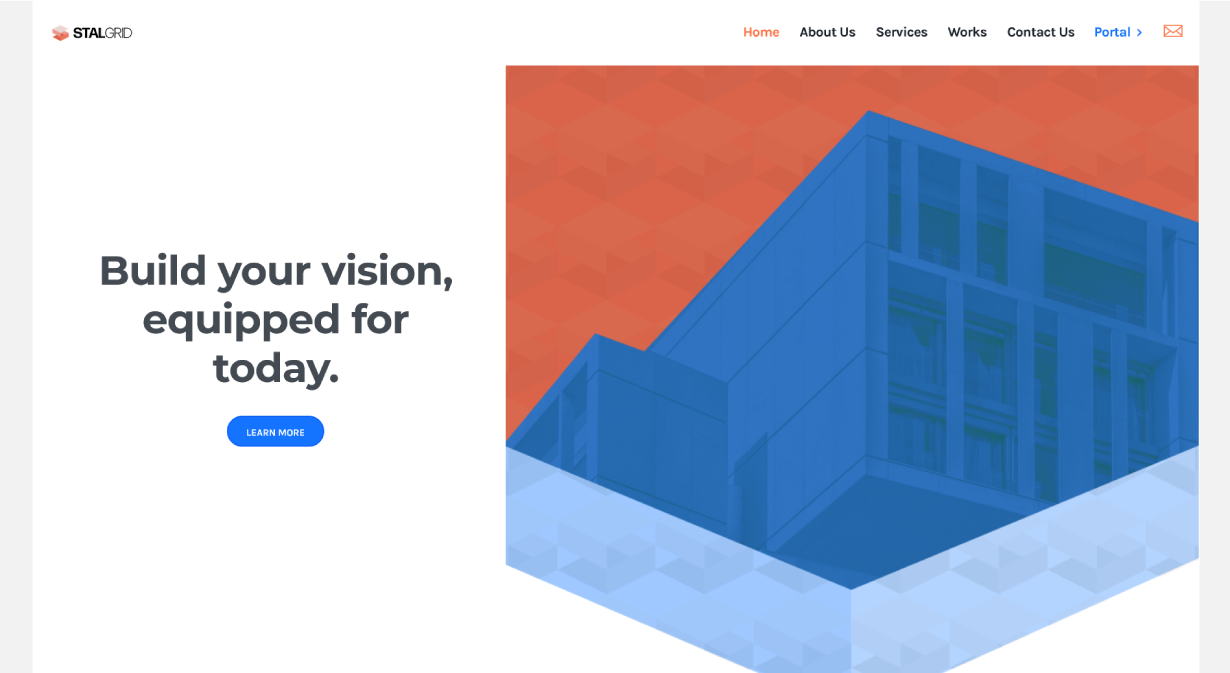
This project began with a logo and brand identity, but also extended into a full website and a collection of varied print materials.
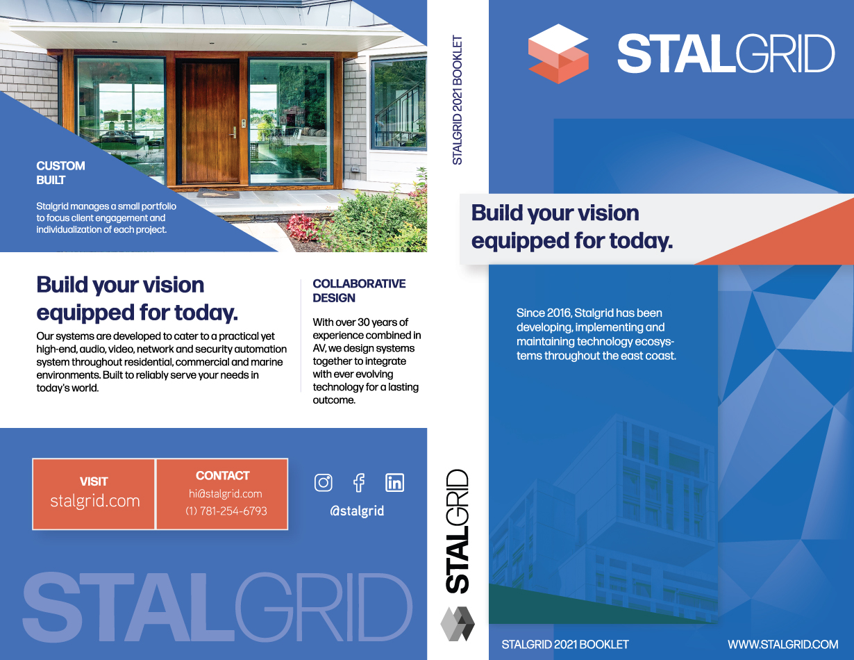
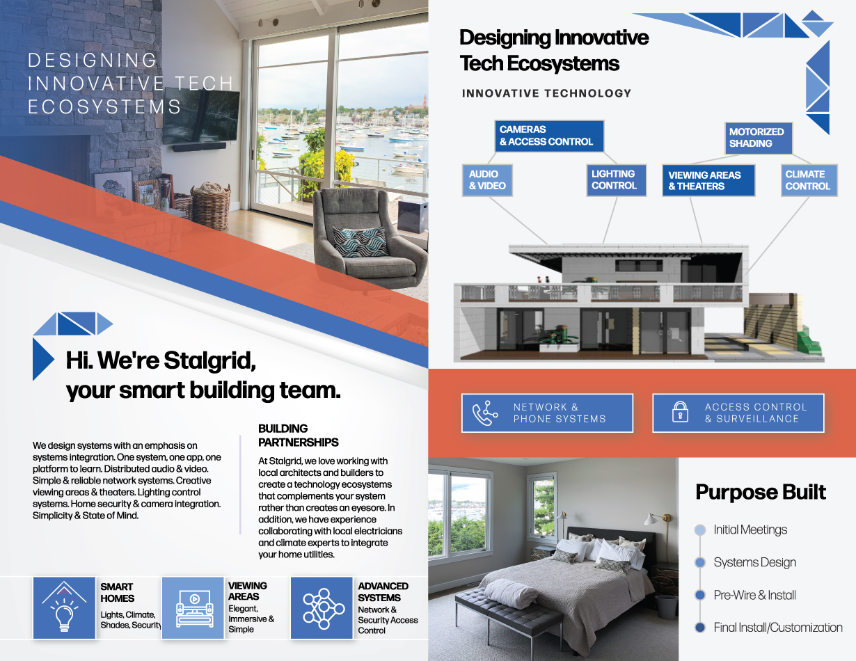
Clean, varied text layouts help to spread the information about Stalgrid and its services.
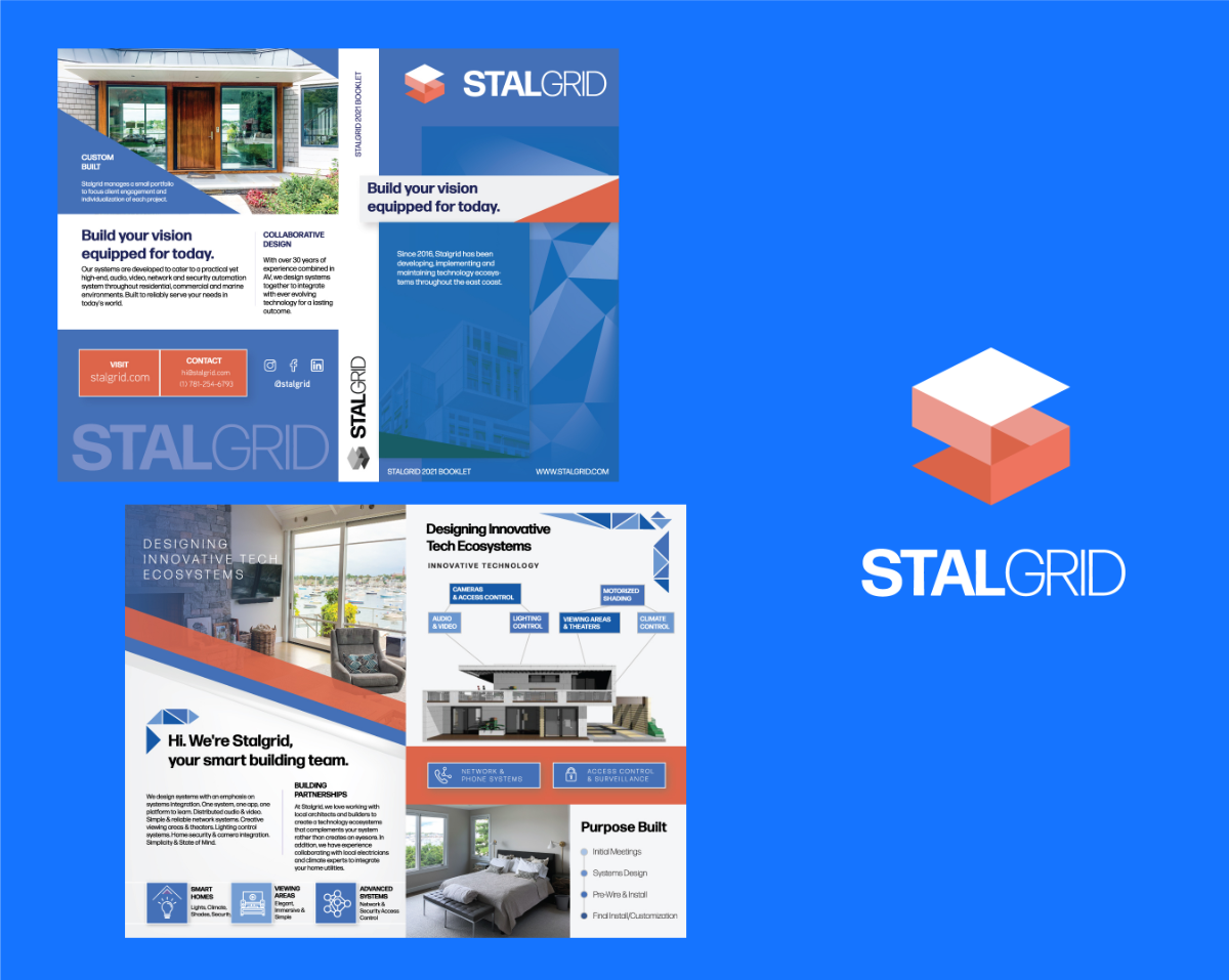
This printed brochure was designed to sell Stalgrid's high tech building services to homeowners and retailers.
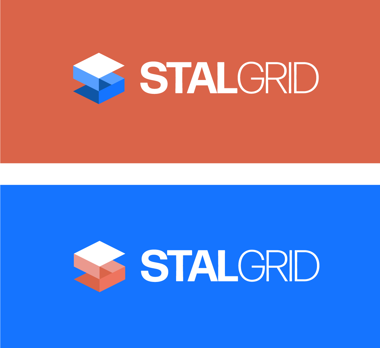
Matching brand materials make this project an all-encompassing identity
Project materials included: